
There's much to learn as you begin designing webpages! Minimally, we need HTML and CSS. If we want any 'behavior' we also need JavaScript! That's a ton to know!
Anything that can speed us up is welcome!
It so happens, Bootstrap5 is a framework that harnesses the power of CSS and JavaScript to speed up production and make webpages responsive. And...it's free!
This saga attempts to put learners on the fast-track to learn Bootstrap5 while solidifying their knowledge of HTML and CSS. We even threw in some JavaScript!
To document our train of thought as we developed this app, we set up a list of stages so you can easily compare/contrast the various stages.
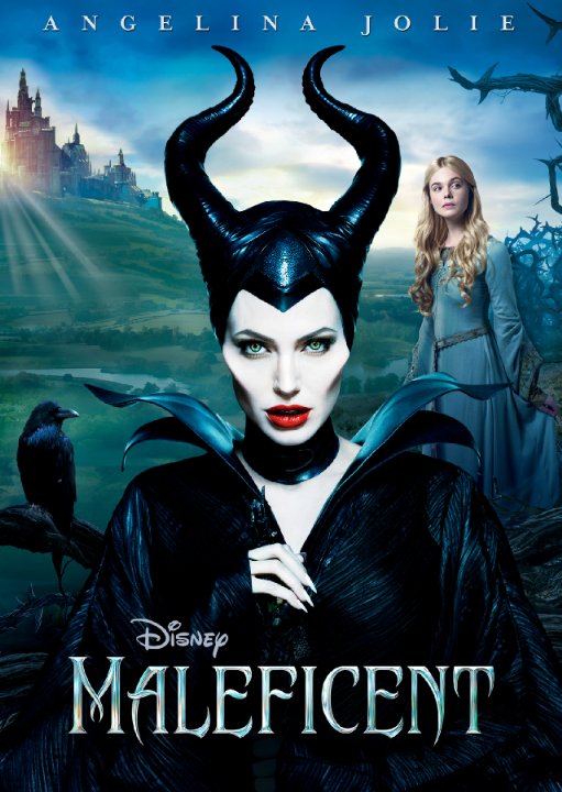
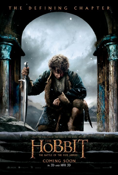
2014 Movies: Development Stages
Sort Stages:
For fun:
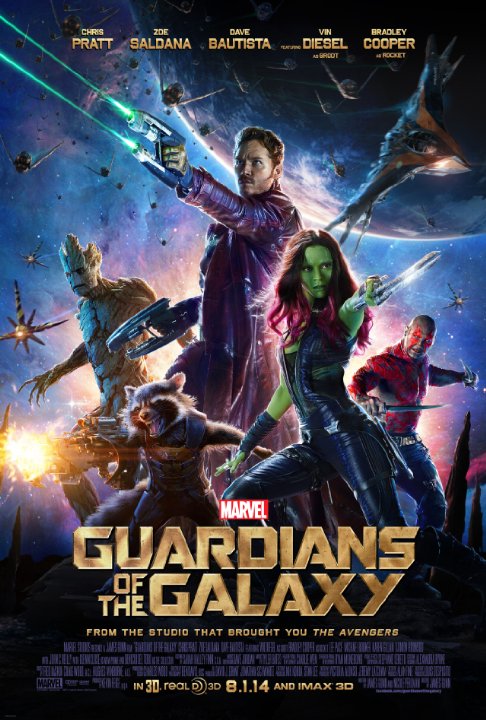 Stage 0 --
Preliminary HTML structure, plain vanilla.
Has no way to link back to this page other than by using the browser 'Back' button. No styling. Blech!
Stage 0 --
Preliminary HTML structure, plain vanilla.
Has no way to link back to this page other than by using the browser 'Back' button. No styling. Blech!
Stage 1 -- Added nav and main  tag areas, and a navigation image nested inside the navigation area.
Added some 'white space' between HTML
tag areas, and a navigation image nested inside the navigation area.
Added some 'white space' between HTML figure blocks to enhance readability. Ensured HTML Validity. Whenever possible, use semantic elements in your designs, such as nav, main, header and footer.
Stage 2 -- Utilized the Bootstrap5 CDN. Look at the 'header comments' in this stage to see a chronology of work done. (Remember you can use your 'x-ray vision' to see source code: Shift-Ctrl-J anywhere in the page's body.) Notice how the incorporation of the BS5 styling 'ecosystem' changed the fonts on the page from 'serif' to 'sans-serif.'
Stage 3 --
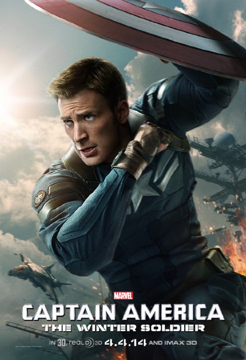 Added some BS5 'classes' to key structural elements:
 body, nav, figure, figcaption. Read the page's comments for specifics. Notice how we can't see the heading at this stage: a violation of the C.R.A.P rule! It is common and desirable to add a temporary background color to an element to see its role in the page. We did this with the main tag. Notice it is centered in the body but the figures are not! Resize your browser window to see this. Note! if you make the window large enough the figures begin to arrange themselves horizontally! Detective! Can you discover what aspect of our code so far is making them arrange this way? How could you do that?!
Stage 4 --
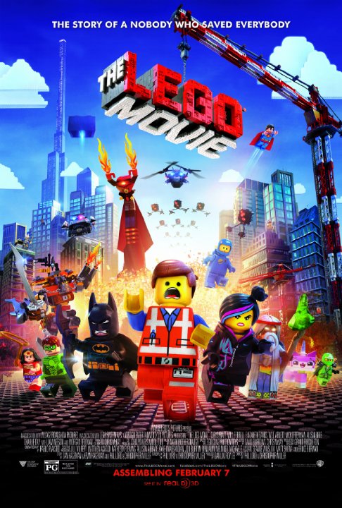 Navbar work: We can see the heading now! We made
 nav a container-fluid element and used the navbar-brand class as a 'wrapper' for the content. Can you solve the mystery of the blue underscore that precedes the heading?!
Stage 5 -- Began adding some of our own CSS styles with page-level styles. A variety of 'selectors' were used to target either specific elements or 'all' elements of a certain type. 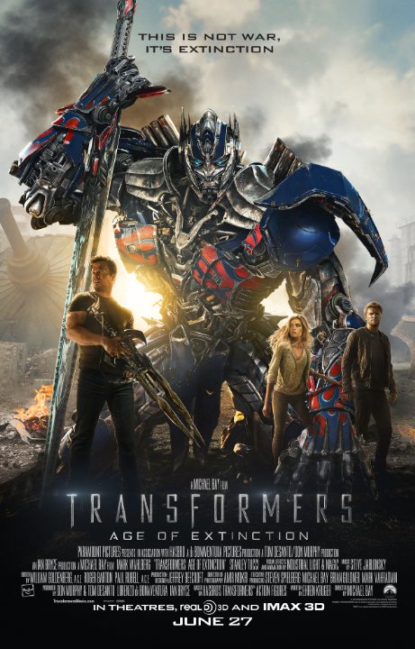 When our desires conflicted with BS5 styles, we had to add a
 !important designation to override. We encountered some mystery with BS5 justify-content-center and our CSS style text-align:center on the main tag.
Stage 6 -- "There's more than one way to skin a cat" ... or style a page. In this stage, we implemented a BS5 display scheme: d-flex along with flex-wrap and justify-content-center to get the same effect we did earlier with our custom CSS style on main.
Stage 7 -- Spiffy additives: a favicon from our friends at favicomatic and some more careful crafting of our header area in the nav. We also discovered that a benefit of using d-flex is that we no longer needed CSS font-size styles for the figcaptions. Looks much better now! (Compare Stage 5 to Stage 7)
 Stage 8 --
“Holy Release Date, Batman!” We had no idea we could reorder
Stage 8 --
“Holy Release Date, Batman!” We had no idea we could reorder flex elements by a CSS order property! In this case, we used an ordering criterion of release date. Zowie!
Stage 9 -- Dang! (Yippe??) We had to add some more movies! When attempting to sort the figures by 'gross' we found 2 other entries that were top performers! Can we get our webpage to count how many entries?! This looks like a job for the DOM and JavaScript!
Stage 10 -- Order! Order! Can we use JavaScript to target the styles we want to display our flicks? Why yes, with external style sheets that's entirely possible! Now, we don't have to have several versions of the same page: one page, multiple options! We also added some non-breaking spaces and a couple of br elements to some movie titles so there were no awkward line-break issues making the title look weird when the posters resized. Think this is too picky? Well, some of the most famous companies in the world worry about details.  Another detail we should mention: notice how the online on the selection buttons changes as it is clicked? Notice how its color matches with the 'Select ordering' in the subHead? That's deliberate and we used a non-so-common-but-helpful inline CSS style to pull this off.
 Stage 11 -- Grand Finale!? Since we've gone to all the trouble of showcasing movies, why not link to each one? Also, we used JavaScript to create a couple of variables to store the last update for the page and its stage and put them in a
 footer element to make them less prominent. A bit of CSS Positioning helped get the footer at the bottom of the page.